A new star is born
By Julius

As we are developing new.space, we’ve also been taking some time to further develop our logo and branding for the app. The initial sketches and concept formed around looking at the cards in the space and recognizing that there is a star right there in the gap! Combined with the thing being called a space, and well, the rest was history.
![]()
The first star
With a bit of polish, we had a lovely logotype born from this initial sketch.
![]()
A solid beginning
As new.space has grown, we’ve also been working to improve the visual identity of the product. Since every visit to new.space creates an entirely new, blank space, we wanted to make sure that the landing page felt fun and inviting.
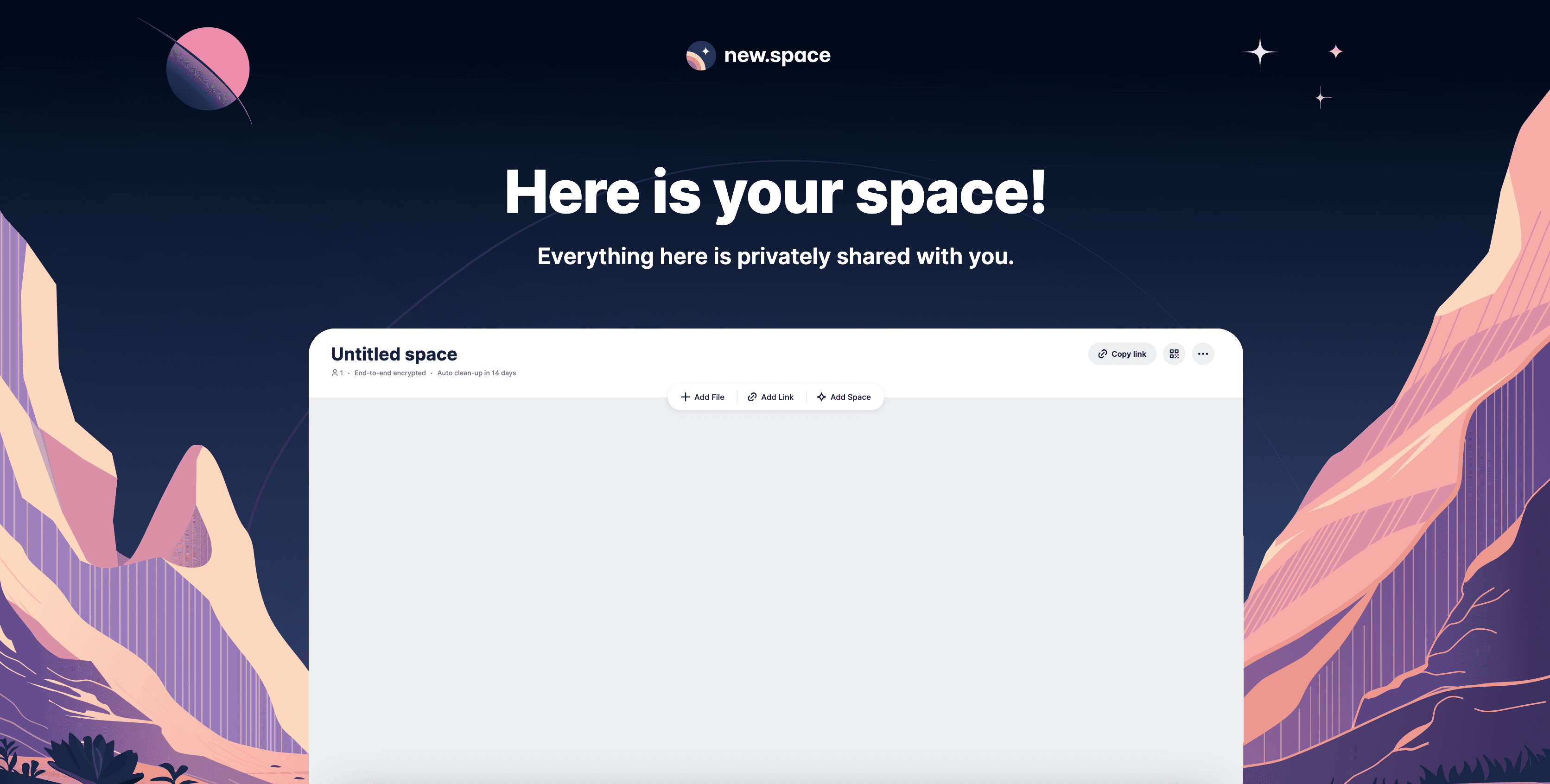
Nestled in a valley on a distant planet is...your space!
This background illustration set the tone for picking colors and developing the brand further. We developed the image as a landing point for your new space that just got created. From the beginning we looked for ways to highlight the plurality, flexibility, and uniqueness of spaces in the form of a symbol.
We loved the geometric shapes of the album artwork from Tycho, and explored breaking down some of these interesting shapes. In addition to that, we picked up a NASA Graphics Standards Manual, which turned out to be an amazing source of inspiration and resources.
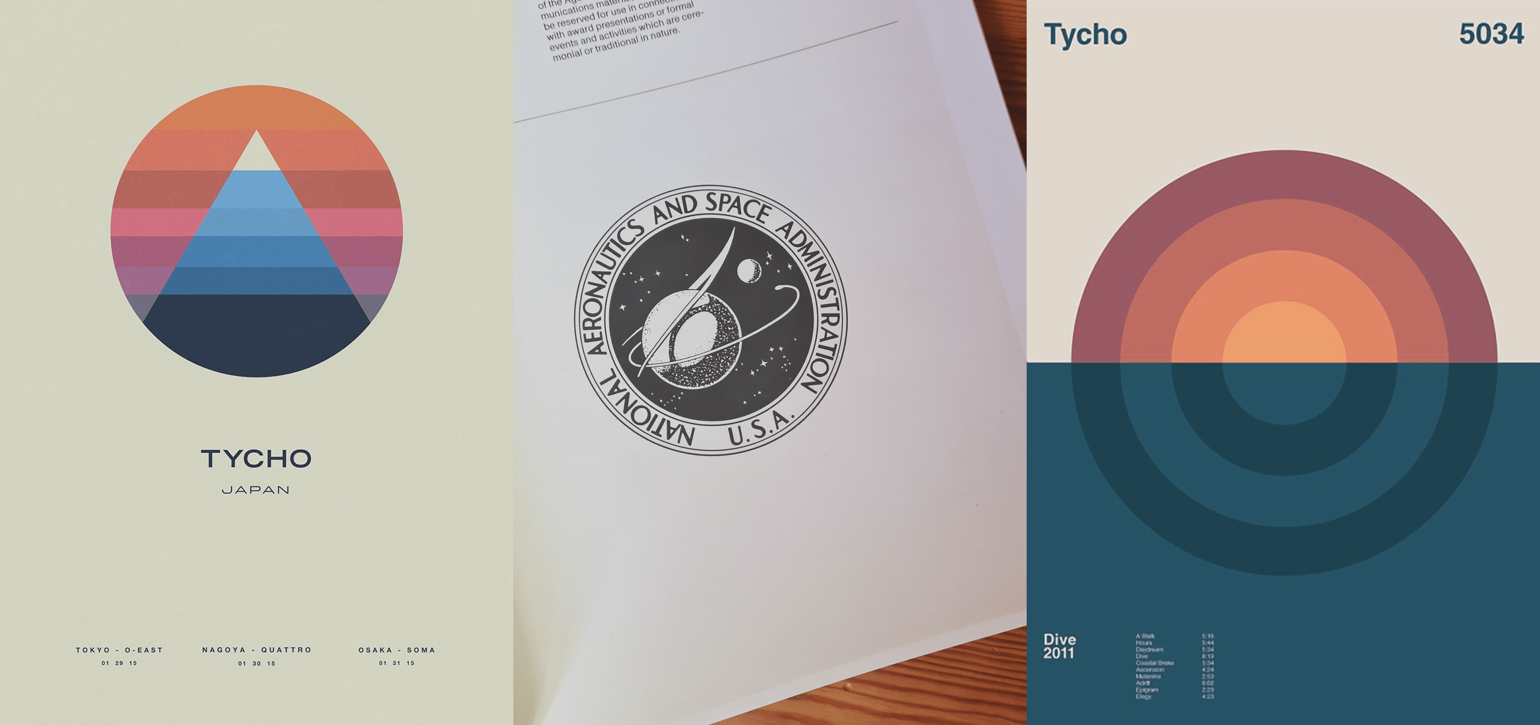
Tycho art is pretty great!
In the end, we came back to core shape of our design language: the circle. Combining this shape with our star from previous explorations rising on the horizon, we had something special on our hands.
![]()
Ready for TestFlight
Combining these shapes together with our color scheme from the valley illustation above, and we instantly fell in love with the logomark for new.space.
![]()
Nice.
We knew we had a solid base when we saw how many color schemes worked with our shapes. These will definitely pop up somewhere along the line as some alternate options users can pick from, so stay tuned.
![]()
It is sometimes hard to pick
On the topic of things coming soon, new.space is in early-access. If you would like to try new.space, we are rolling out invite codes to members of our Substack community. Come by and say hello 👋
Till next time, happy sharing!