Finding silhouettes
By Adam

A bit ago I worked as a designer on the Sticky Notes team at Microsoft. We faced a fascinating challenge when exploring integrating Sticky Notes into other apps: how could we ensure that users wouldn’t confuse the Sticky Notes input with other text surfaces? Some applications had comments or other integrations, and the possibility of creating confusion for the user was very real. We solved this by utilizing a design technique called silhouetting, in which we take the primitive parts of our app and define how they look without content. The idea here is that if the shape of something is clear enough, it will be safe enough to exist alongiside other types of components.

This isn’t a shortcut to having a cohesive UX, however. One still has to do the hard work of making sure that the design of your app and components are well thought through. Having clear and unique entities doesn’t immediately make your design functional. Rather, this tool simply gives you the ability to look at your UI and see if things are too similar or differentiated enough.
In the early days of designing Shareup, we started seeing the need to take a step back and go through this exercise ourselves. As we started to conceptually consider the combination of files, wesbites, documents, and devices in shared spaces (or even alongside those spaces) the entities were not always clearly differentiated enough. We decided to rethink the silhouettes of our components and make sure the various parts were weighted correctly.
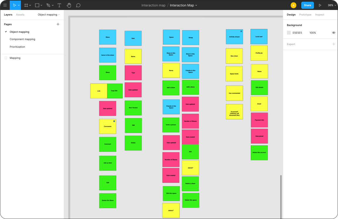
The first useful step in this process is to take inventory of your components and their attributes. I found the tactics in this article by Sophia Prater on interaction design to be useful for understanding how to think about separating the different portions of your application. We created a virtual whiteboard and stickies layout using Figma and found it was super effective as a collaborative space to do this work.

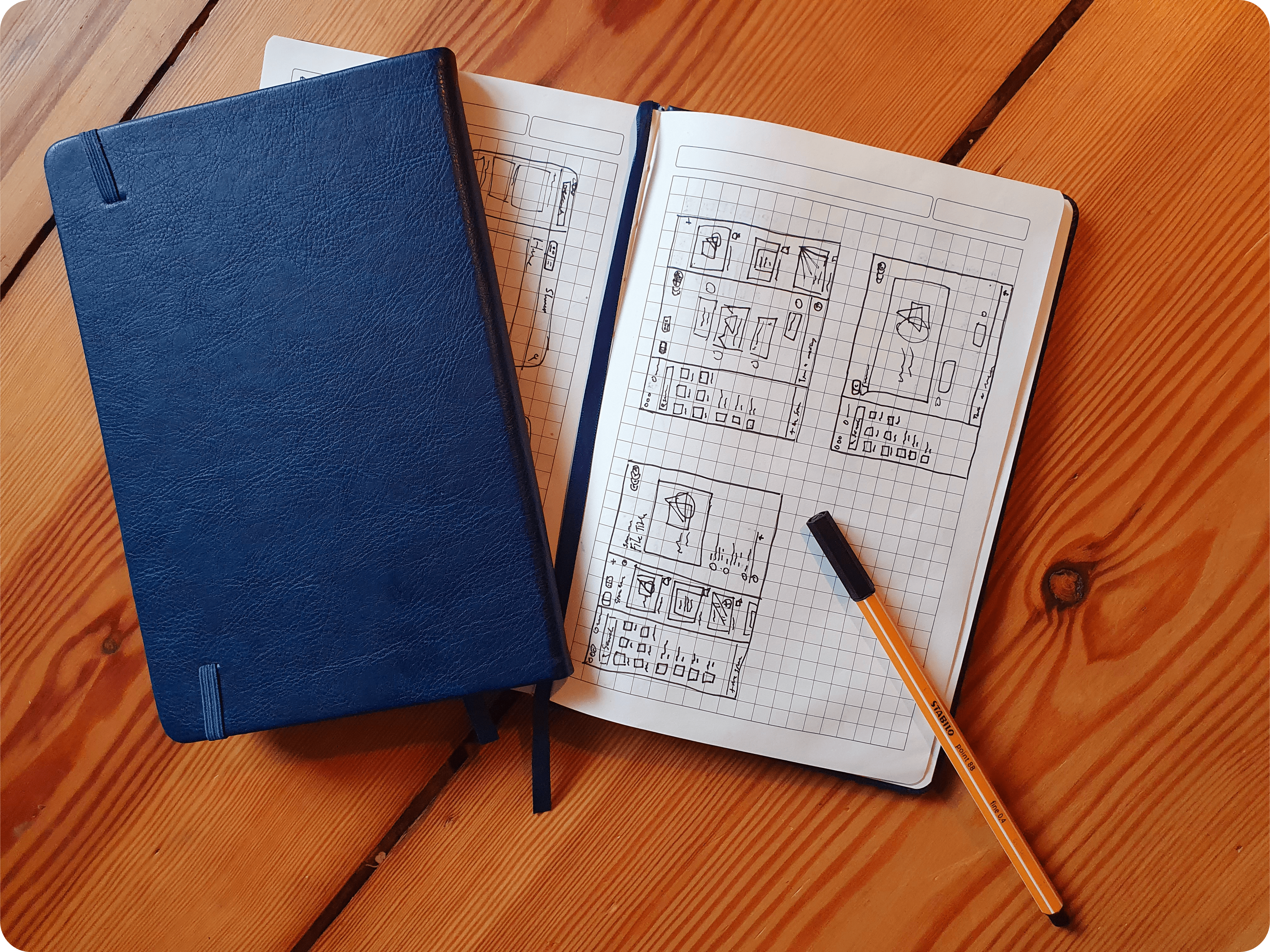
The process of itemizing everything is challenging, but it is important for getting started with the sketching process. I prefer to keep it simple and break out a sketchbook and pen to force myself to keep the fidelity low.

It is important to iterate and test your assumptions frequently. Once you have basic shapes that make sense, the job isn’t complete. The last part is taking these results to the next level and testing your designs with more fleshed-out and detailed content. We are excited about the work we are doing with Shareup—the easiest and fastest way to privately share—and we can’t wait to show you the results of the silhouetting we’ve been doing to ensure that we are delivering the best experience possible.