How to work with color and a blue light filter
By Adam

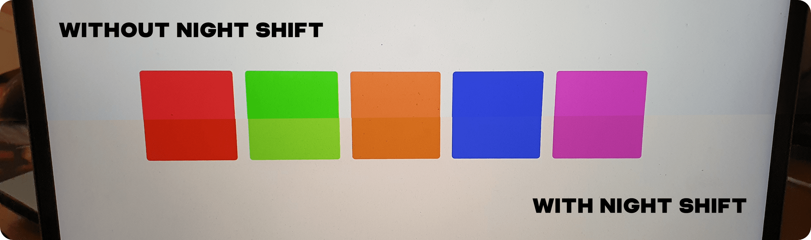
In some parts of the world, the winter months mean darkness for the better part of a 24-hour period. In December there might only be a few hours of sunlight, and by 4 PM it is completely dark. As a designer working in this environment, I grow increasingly frustrated by looking at a bright and cold screen. My eyes never seem to fully adjust, and I find myself drawn towards using Night Shift to make the screen’s temperature more bearable. Doing that however, makes working with color pretty impossible.
There is a little tool that is always open on my computer. It ships with macOS and is so useful. I’m amazed more people don’t talk about it. The Digital Color Meter is a handy little application for telling you exactly what color something is, regardless of your screen’s temperature settings. This has allowed me to be able to turn on Night Shift and still be able to verify what color something actually is.
On top of that, this tool is really great when reviewing other designs or checking out others’ work for inspiration. Grabbing color is as easy as ⇧ + ⌘ + c for the basic hex or ⌥ + ⌘ + c to copy an image of the color. This can be great for collecting a mood board or building out a color scheme to quickly share.
Overall this is a powerful app in an incredibly small package that has so many uses. If you find yourself struggling to work with color because of a poor quality monitor, lighting setup, or while using a blue light filter, try using the Digital Color Meter. For me, it is one app that is always open on my Mac.