How we made our site 7x faster
By Adam

Performance improvements for websites are often a crunchy task that can be difficult to navigate. Is it CSS or JavaScript related? Is the slowness happening on the server or the client? Are images or other assets blocking loading? Are they in the wrong format or incorrectly sized or compressed? There are so many questions to ask and it can truly feel overwhelming if you don’t know where to look.
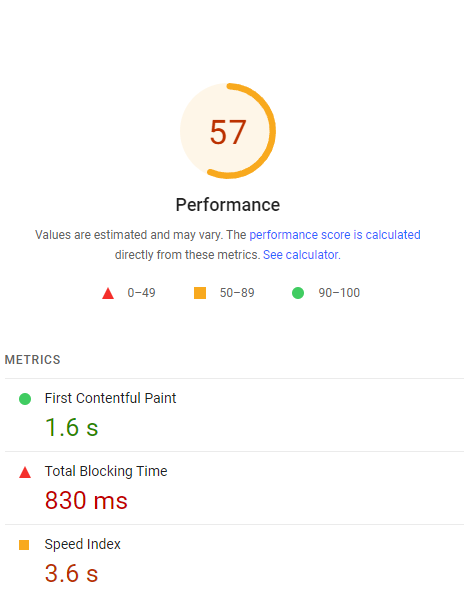
Luckily, there are some useful tools to give you some insights on what is happening and find ways to improve it. One that really gave a great overview from Google is PageSpeed, which gave our website a pretty poor mobile score. The good news however, was that there were pretty clear problems that we could address. So we set out to look into them.
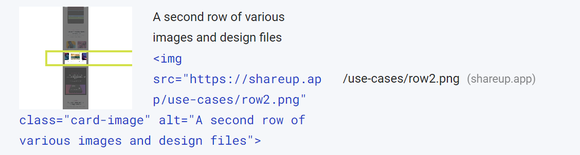
The biggest factor that contributed to the poor mobile score was that we didn’t do any specific handling for mobile sized images. Any mobile device going to Shareup.app would get the same assets as a desktop device viewing the site. When making the site initially, this felt ok since we were really aggressively compressing the .pngs, but there were some inefficient images like these ultra wide images in the design use-case section, which were way wider than they needed to be.
The tool shows you specifically which images are outside the viewport
Creating responsive images is nothing super new to web development, but there are some new tools that we have access to today. The first tool is the srcset attribute, which gives us a handy way of creating a list of fallbacks that describe different sizes that the images will render into. In addition to this, we opted to use the picture tag, which allows us to separate the individual source elements. We chose to do it this way to make the code more maintainable with our templating engine, but you can choose <img> or <picture> depending what is best for your own project. Making this change gave us some nice improvements to our score,but there was still more we could do.
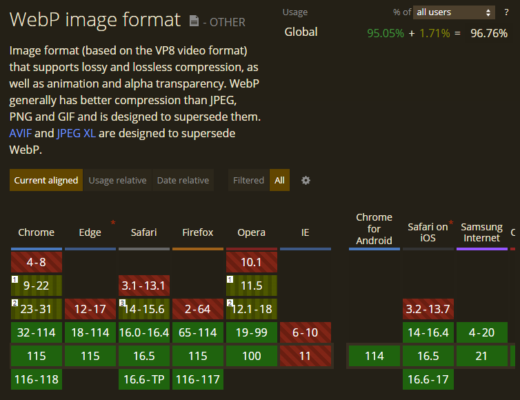
Reading further into the report, there was a section about “next-gen image formats”. Now that sounds exciting and exactly like something that won’t work in most browsers, so we initially ignored it. This next-gen format however, turned out to be a key to making clear and crisp images that were very small, and unlocking the ability to cut that blocking time by a lot more. Webp has been around for a little while now, but it was mainly only available in Chromium based browsers. To commit time to just one browser segment didn’t seem like the best use of time, that is however until we checked the caniuse support page and saw that nearly all major browsers today support the format.
At this point, we already had desktop and mobile sizing of all our images and added a srcset for each, so all that was needed was to create the webp versions and add in the new srcset. There are many ways to create these conversions, we opted for a simple script that just took our image folder and created ated a webp version of each using the cwebp tool from Google. This took 15 seconds and with our updated template, we were ready to check the score.
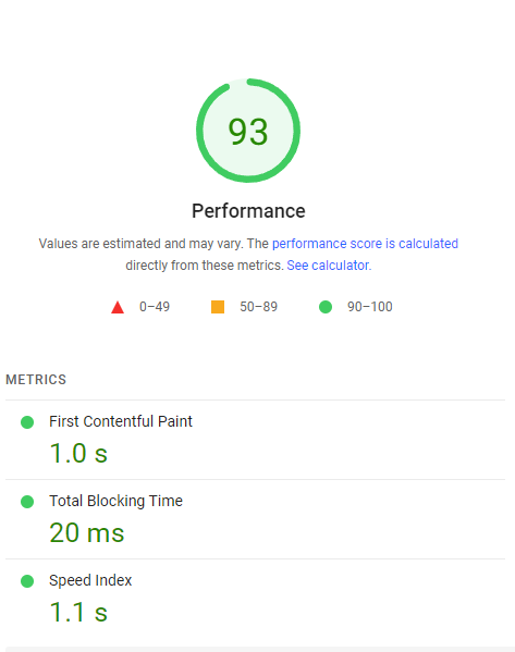
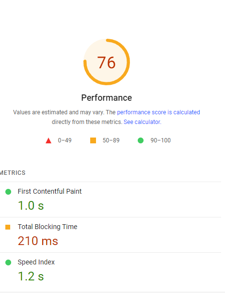
Nice. With this change deployed, the site felt snappier across the board on every device we tried. Sometimes the tool gives a higher or lower score, which is an interesting thing to investigate in the future. As a closing note, we’ll be doing these ‘perf checkups’ once or twice a year and use it as a time to read up and learn about not only what is fancy and new, but also learn which of yesterday’s fancy and new features are available today to improve the experience. For people doing the math at home, we took the total blocking time from 830ms to 20ms, a 40x improvement on average! In the title we said that we made the page 7x faster, but that is honestly just because 40x improvement often doesn’t sound believable. Try .webp, it is a gamechanger!
On the topic of providing the best experience possible, we are always looking for feedback and ideas on how to make our app new.space even better. If you have ideas (or haven’t yet tried the app and would like to), come join our Substack community, we’d love to hear from you.
Till next time, happy sharing. 👋