Using a font editor to create custom SF Symbols
By Julius
Hello, I am Julius and I’m responsible for the visual design here at Shareup.
Our first product, new.space lets you securely share anything with anyone. Each visit to new.space creates a shareable page where everything is end-to-end encrypted. These are some slightly complicated topics, and we wanted our iconography to convey information across our apps and experiences as clearly as possible.
We developed our own iconography and used the SVG format to integrate it into all of our products. This approach has served us well so far, and renders crisp and clear vector renderings of our icons.
Now that we started building our second product, an iOS app called Spaces🤫, things became a bit more challenging to implement. Although SVGs can be used in iOS easily, they have one big flaw: SVGs don’t support dynamic text and therefore make them inaccessible for some users.
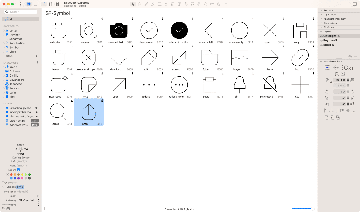
Iconography plays an important role in the identity of an App. Since both apps share the same design language and systems, we decided to create our own SF Symbols.
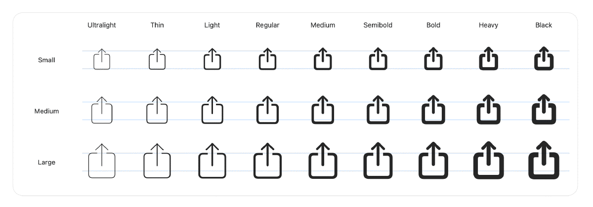
SF Symbols is Apple’s iconography library that’s designed to integrate seamlessly with the system font San Francisco. What makes SF Symbols special, is that it allows the designer to control variables in weight and size. Each of the symbols has nine weights and can be set in three scales.
This flexibility allows not only for a better adaptation into any design, but also makes them fully accessible by supporting dynamic text.
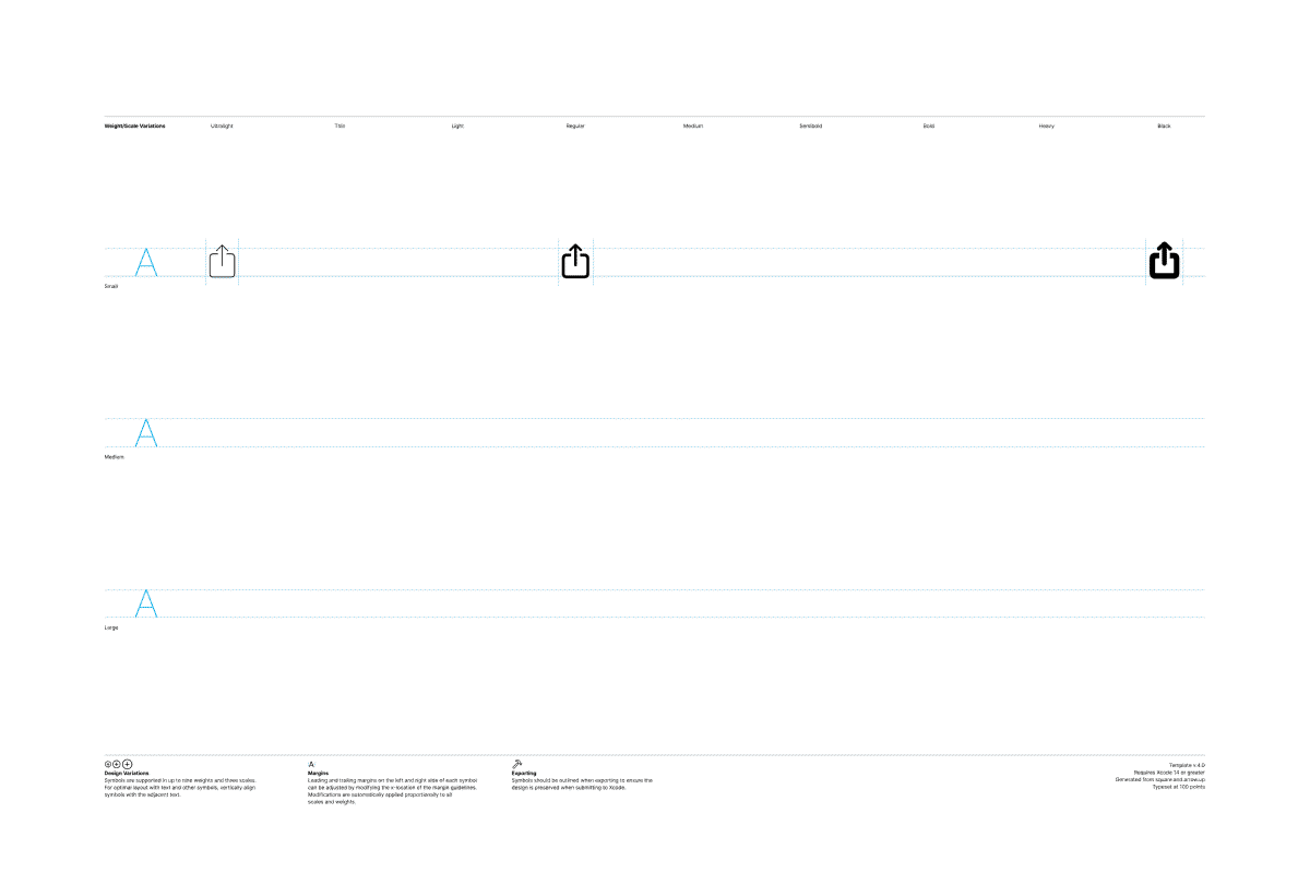
To create a custom symbol, begin by exporting an existing symbol as a template. This will provide you with an SVG file that can be imported into your preferred vector editor. Next, you have the option to modify the existing symbol or replace it entirely with your own design. Finally, export the template as an SVG file once more and import it back into the SF Symbols app.
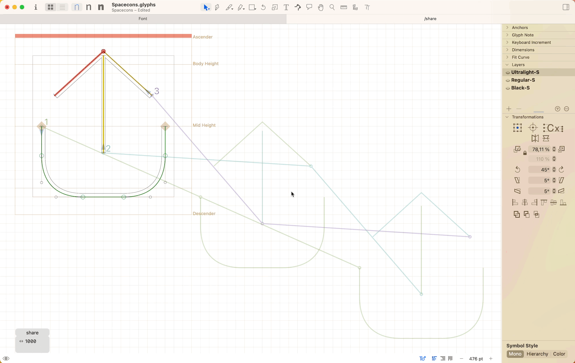
Since each SF Symbols has nine weights and three scales, creating 27 instances for each icon can be very cumbersome. Luckily, Apple makes this easier with a dynamic template which only requires three instances to be drawn. Ultralight-S, Regular-S and Black-S.
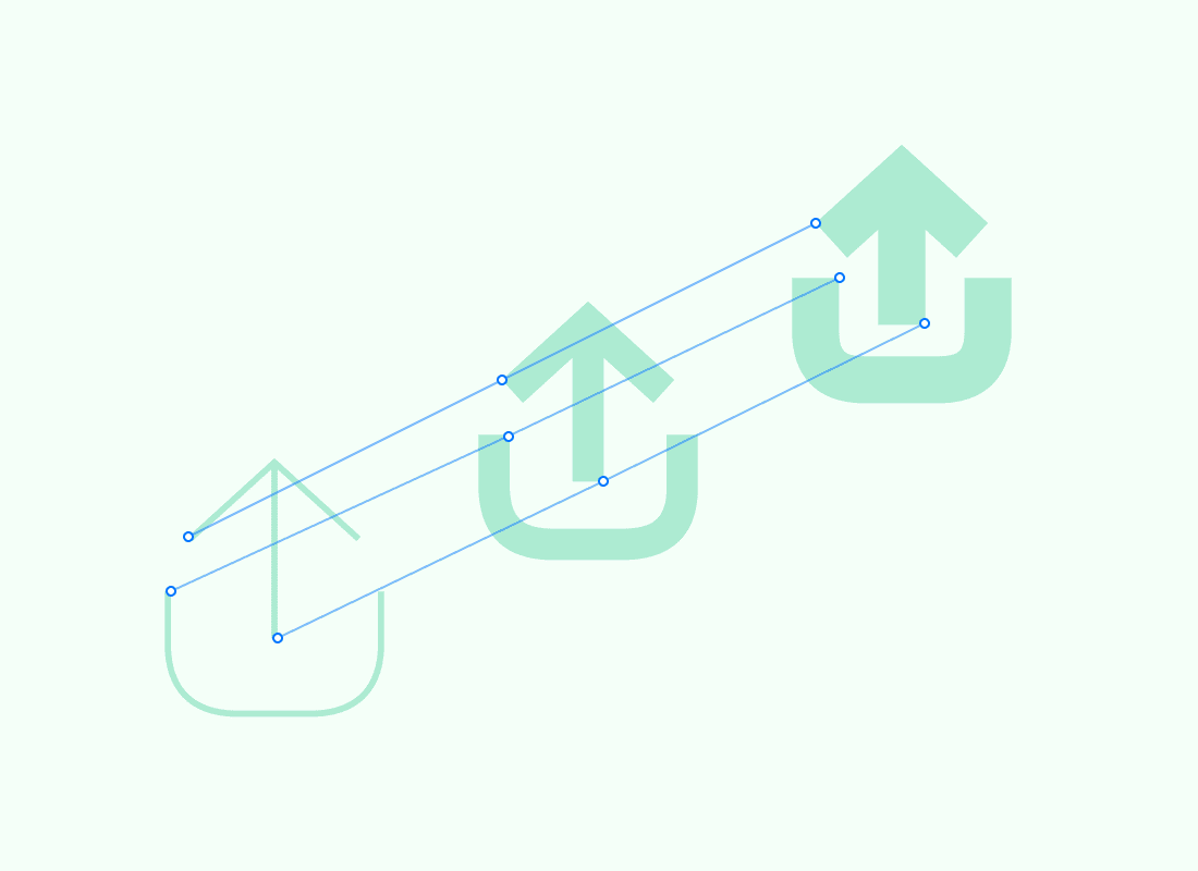
The challenge here, lies in ensuring the compatibility between each weight of the symbol. In order for the app to successfully interpolate between different weights, every path must have the same number of anchor points, starting point, and direction. If any of these elements differ, the symbol cannot be imported, and an interpolation error will be displayed in the SF Symbols app.
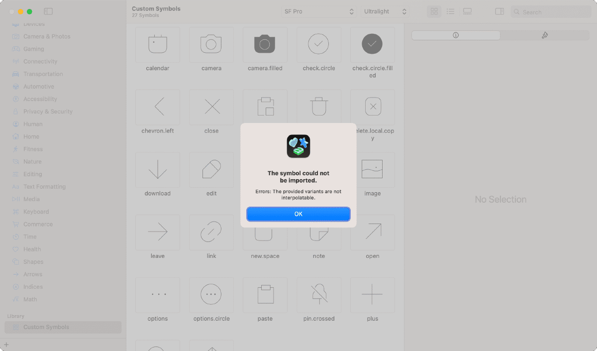
Figma has no way to control these elements and therefore it was hard to figure out what’s going on. We tried different vector editors such as Affinity Designer, but none of them could really offer full control and therefore lead us having interpolation issues and no way to solve them.
Entering Glyphs app
One thing that struck me right from the beginning, was the fact that designing SF Symbols felt more like creating a font than “pixel perfect” icons. This makes sense since their goal is to work seamlessly with the system font. After struggling with normal vector editors, I remembered I used a font editor called Glyphs in the past to create icon fonts for Wunderlist and Microsoft Todo.
Though it may look intimidating at first, Glyphs is an easy-to-use Mac app for creating fonts. And after some research I learned that it actually allows importing and editing SF Symbol templates.
How does it work?
After activating the plugin to import SF Symbol templates, you can import an existing SF Symbol template and start editing. Here is a great article that explains all the details of this process: https://glyphsapp.com/learn/creating-an-sf-symbol.
What makes Glyphs superior to most vector editors, is the ability to control path starting point, direction and most importantly interpolation between variants.
Most issues can be solved with File > Correct Path direction (Shift CMD R) and File > Tidy up Paths (Shift CMD T).
Sometimes you need to help Glyphs understand the connection between each icon. In these cases, View > Show Master Compatibility is invaluable. When activated, the application shows how each path is linked across weights. Sometimes these links can get messed up so you need to manually reconnect the correct anchors. Usually it’s enough to only reconnect the starting points of each path.
On top of all that, you get the benefits of a fantastic font editor. Here are some features that really helped my workflow:
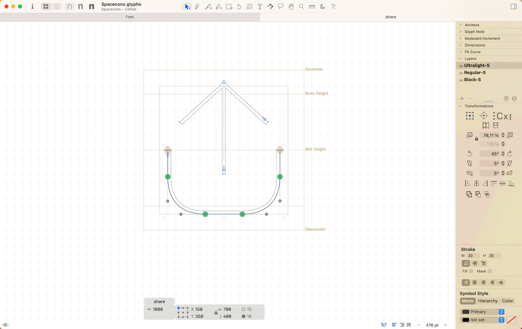
Inset strokes offers a great advantage as they allow you to use a single path for all weights, with varying stroke widths. This means that instead of creating separate paths for each weight variant, you can simply adjust the stroke width, making the process more efficient and streamlined. However, it’s important to be cautious when using strokes, as they can potentially result in compatibility issues. Glyphs will convert strokes into paths during the export process, which can occasionally lead to inconsistencies in the amount of points. In this case I suggest converting strokes to outlines to evaluate the issue.
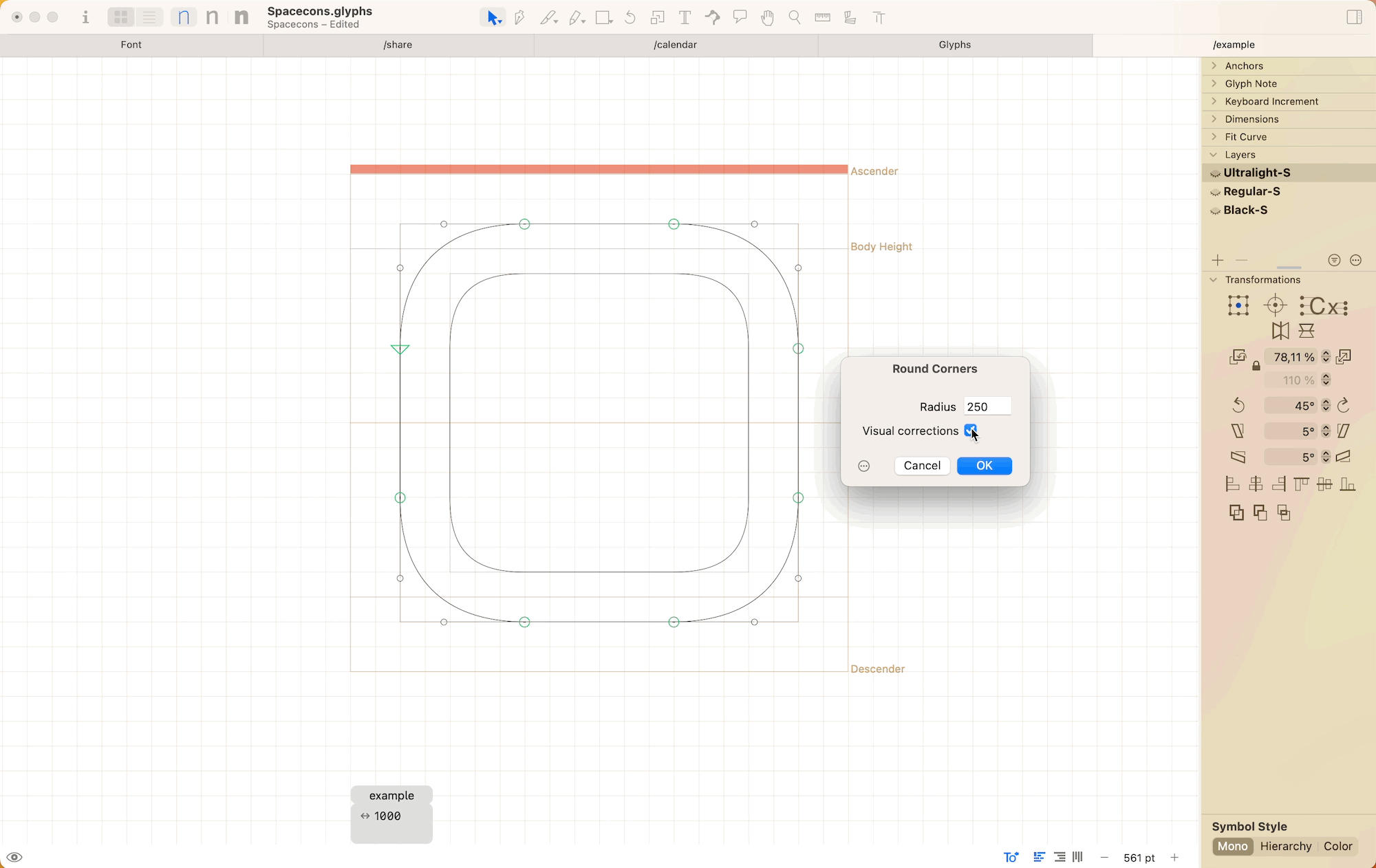
The rounded corner filter in Glyphs generates visually pleasing and visually corrected corners.
Glyphs is not only the best tool I found for creating SF Symbols, it’s also a fantastic vector editor and allows you to do many cool things including creating fonts 😂
P.S.
In the second part of this article I will discuss how Glyphs can be set up to also create a pixel perfect variable width icon font. So stay tuned!
P.P.S.
If you are interested in trying out new.space, just head over to shareup.world and sign up for early access.