Wearing different hats
By Adam

Picking an illustration style and art direction is a difficult process. One has to not only think about the aesthetic of the graphics and the brand, but also consider the pipeline for asset creation in the future. And then there is also considerations of sizing, will it still look good on a small screen? Also, what about making it look and feel new and unique? There is a risk of alienating others by straying too far from what is mainstream. One thing we did when developing our direction was to compare other popular styles and see what they did well, what was worth emulating and what we knew we could do better.
Alegria is a popular style that has been adopted by many companies over the past few years. It was initially created in 2017 by Buck for Facebook and in their illustration rebranding. The characters had a charming, slightly abstract and exaggerated look about them. Soon after Facebook started using this style, these kinds of characters started popping up everywhere.
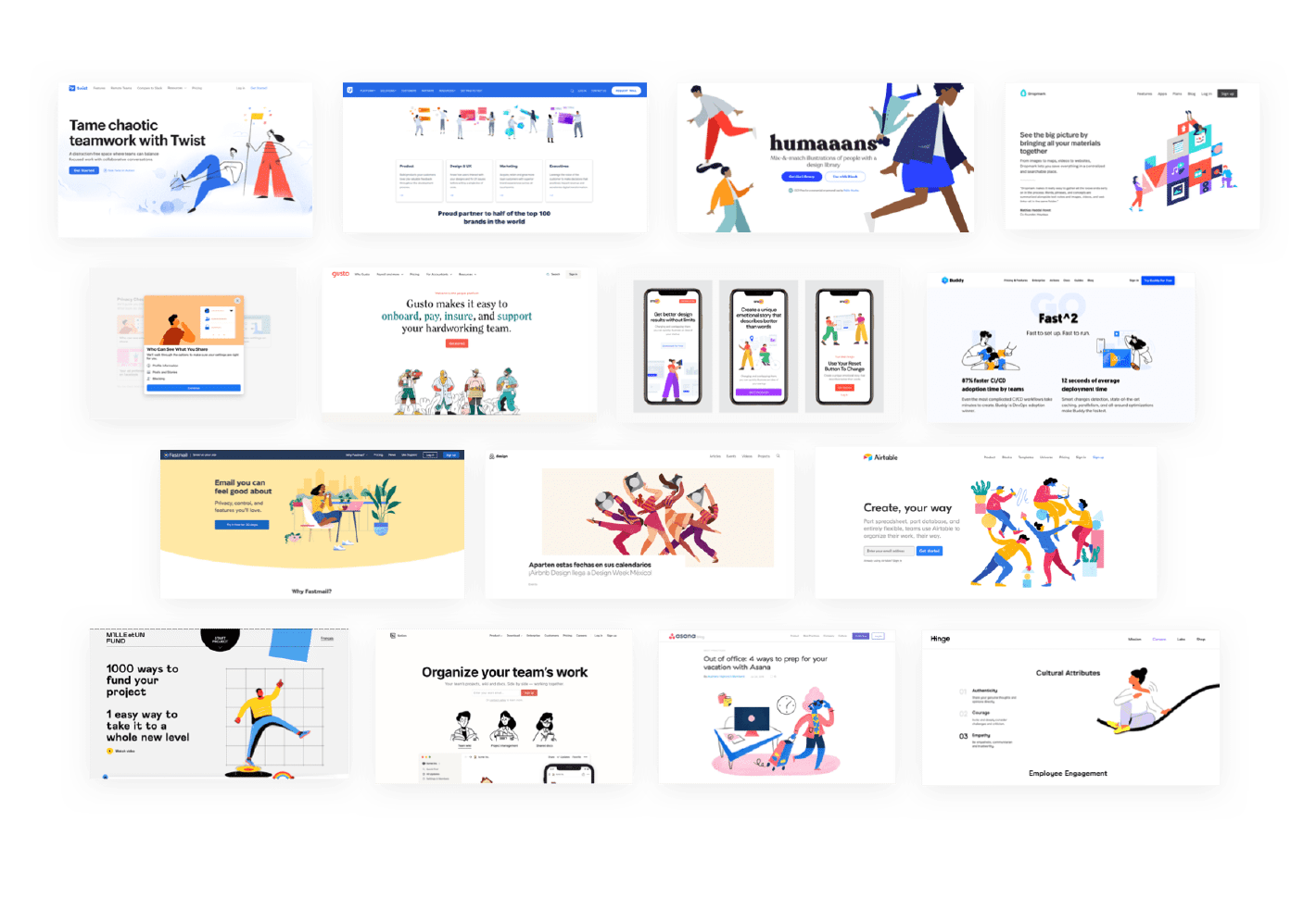
This style has a lot going for it that a company or brand can latch onto. The details are simplistic, the colors are often non-representational in an attempt to appeal on a universal level and the proportions are magnified. All of this combined makes it streamlined for mass reproduction and has led to an explosion in its popularity.
When it came time to explore what our illustration style for Shareup would be, we wanted to create something that gave us the ability to communicate the core parts of the product in a relatable way. In Alegria and other popular illustration systems, the realm in which characters operate is noticeably flat. This flatness allows for easier animation and quick asset creation, but it also makes the characters feel…well…flat. Sketching various styles, we realized that flatness wasn’t going to cut it; our characters need to operate within a world with depth to tell the stories about Shareup’s vision. This gave them the ability to ‘send that file quickly far into the distance’, or ‘take a step back and see their project from a different perspective—things we think are valuable in the product story.
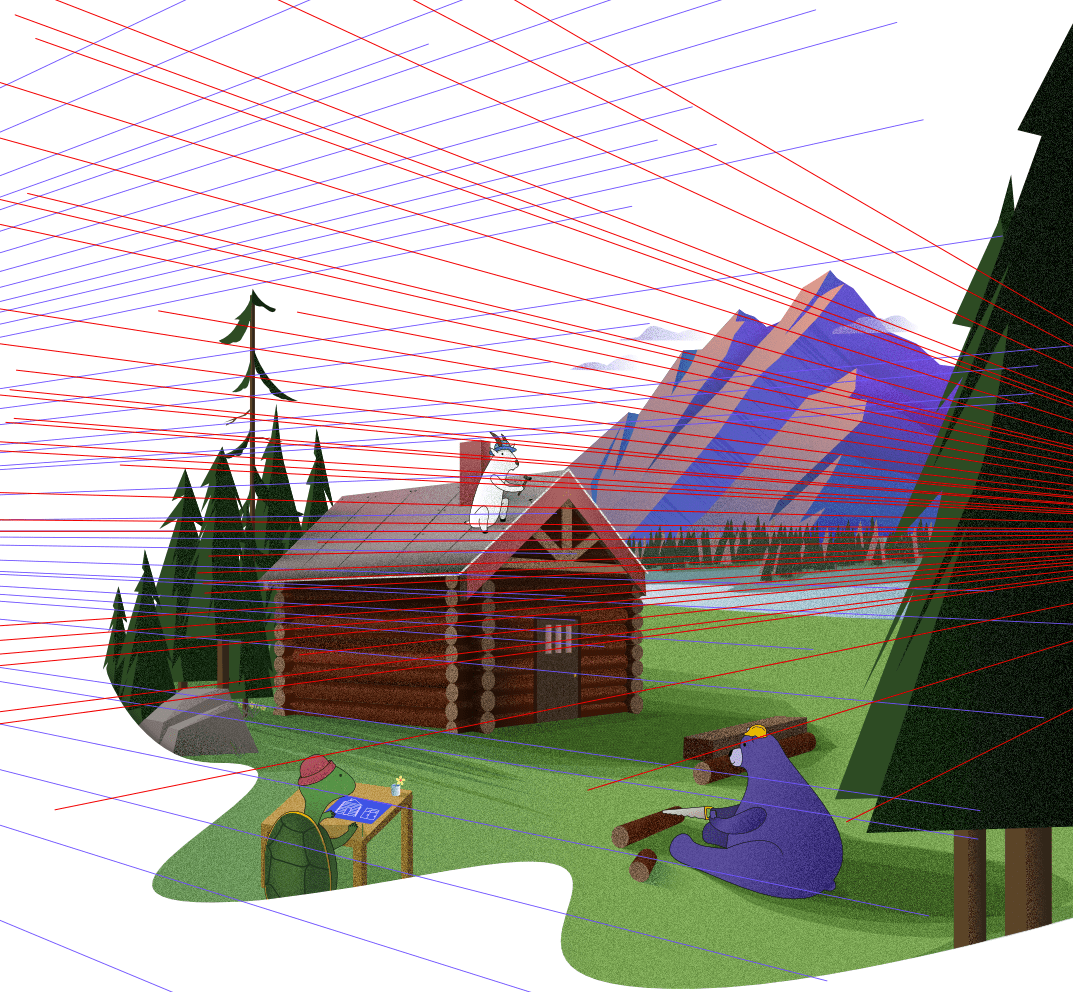
Additionally, we found the animal characters to be the most expressive. Illustrated, they have a unique quality of displaying something they are good at. Goats can climb well, kangaroos can jump far, the giraffe can reach that thing high up. Having humans with exaggerated limbs didn’t communicate this in the same way, so we continued thinking about how teams actually share and create together. The reality is, we usually don’t just do the thing we are best at, we have to wear multiple hats to get the job done. Suddenly, we had this ability to not only give these animal characters an additional layer of expressiveness, but also show them functionally filling other roles. Maybe the turtle isn’t just good at understanding privacy and security, but also at planning and coordinating.
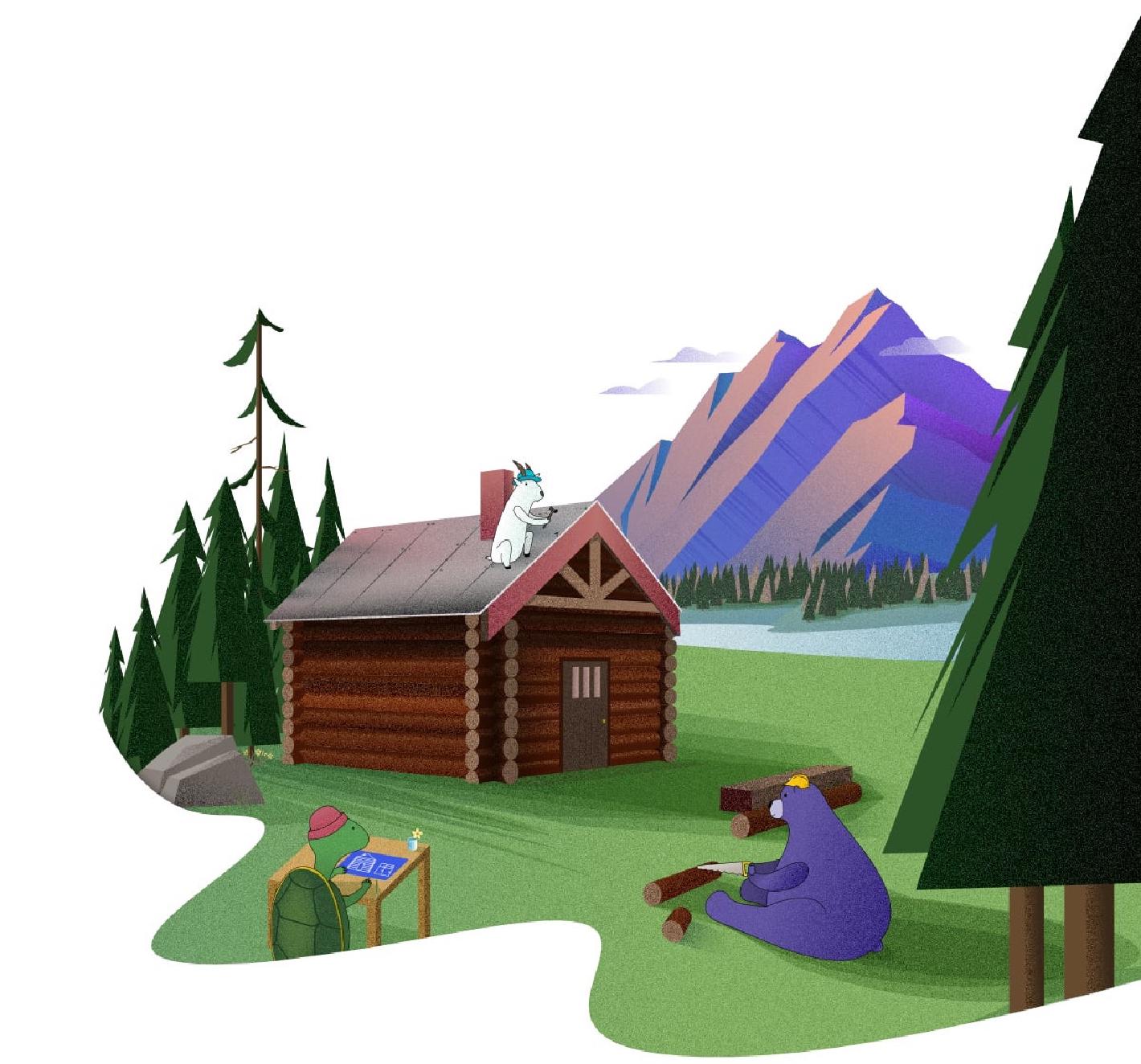
Combining perspective, our animal characters, and hats, we think we’ve found something that is going to help us tell the story of Shareup. We believe that sharing should be private, and you shouldn’t have to trade that privacy for a poorer experience. We can’t wait to show you the next chapter of this story.