What Cooper Black can teach us about software design
By Adam

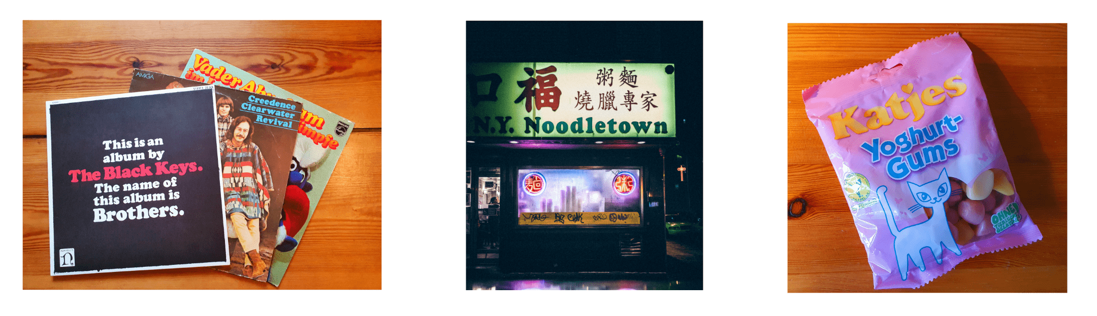
My wife and I sometimes play this game when we go for walks. I’ll say “hey! Do you see it?”, and after a moment’s confusion she’ll look around and try to spot where Cooper Black has been used in the wild. I’ll admit, I probably like this game more than she does, but we both remark often about how incredible it is that the font is simply everywhere. It has been on album covers, store shops, candy, posters, hats and shirts for nearly 100 years now. How is it that this playful typeface can be so functional in so many places?
Designed by Oswald Cooper in 1922, he famously referred to it as a typeface for “farsighted printers with nearsighted customers”. I find that to be a pretty accurate description; everything about the font is exaggerated, big, and bubbly. For those reasons, it is easy to write it off as kitschy or childish or even goofy (what’s going on with that ‘f’?!).

However, this take also reveals where Cooper Black’s true strength lies. This rounded boldness makes content or products approachable. Here is where I think software designers can learn a lesson from this pre-digital era font. Cooper Black is timeless and flexible because it binds functionality and ease-of-use together in a package that works amazingly for so many different products.

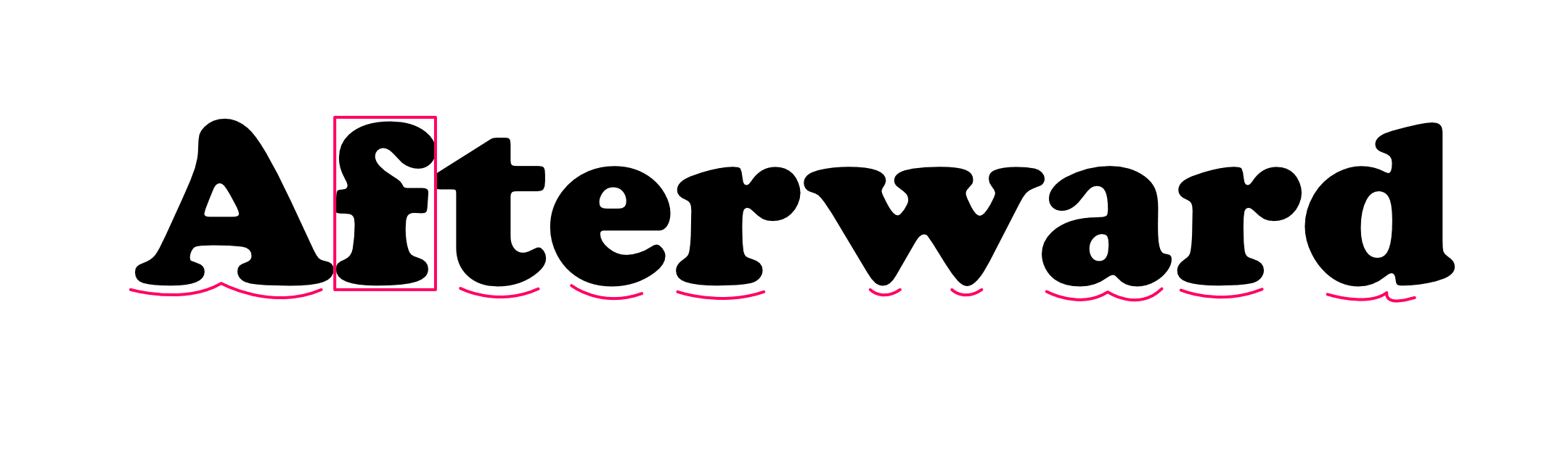
The typeface bends rules that most others don’t dare to. Take for instance the lack of any curved parts on the letterforms like the A. Straight lines at the bottom are largely considered a staple for a typeface’s legibility, but Cooper Black has curves here! Those curves make it not only a more flexible font, but also more forgiving for designers working with various surfaces. This is why the font looks great on a flat store front sign or on the curved side of an airplane. Going back to that weird ‘f’, this character is actually genius. Cooper was able to pack an extremely bold character with lots of intricate details while still maintaining a slim profile. Keeping that detail, without losing legibility or flexibility is an amazing feat.
These are just a few examples of how the amazing design of this typeface has contributed to its longterm success. As we design Shareup, we push ourselves to be like Cooper Black and bind that playful, approachable familiarity to functionality and flexibility. We believe that fast and private file sharing shouldn’t be exclusive to those who understand encryption. Instead, it should be available and easy for everyone. So next time you are out walking and see Cooper Black in the wild, take a second and appreciate the curves and its funny letters, because they are from a time before our time and can teach us a lot about where we can go next.